Zen Capital: A Financial Hub
What approach can we take to redesign Zen Capital's website to build trust, enhance usability, and increase client inquiries?
What approach can we take to redesign Zen Capital's website to build trust, enhance usability, and increase client inquiries?
What approach can we take to redesign Zen Capital's website to build trust, enhance usability, and increase client inquiries?
The Problem
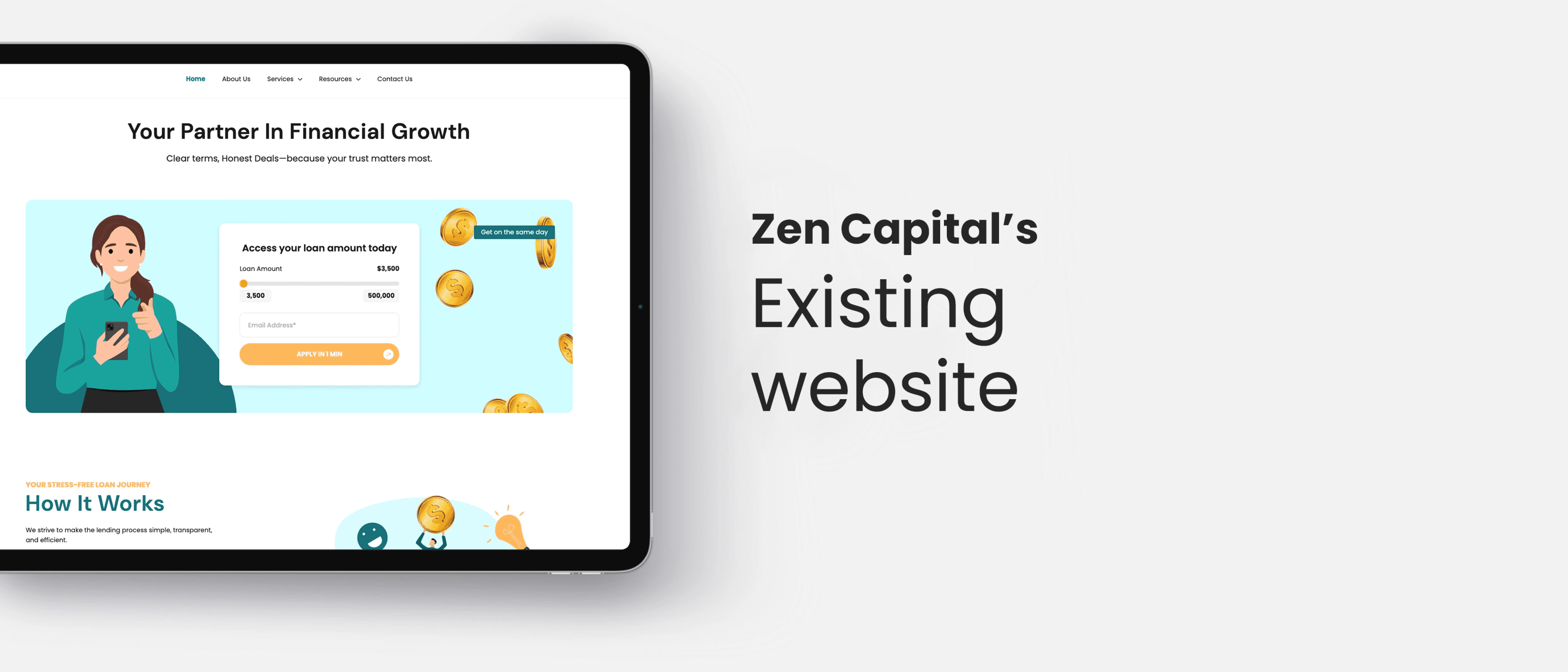
Zen Capital’s existing website struggled with multiple challenges. Visitors often found it difficult to understand the company’s financial offerings due to unclear messaging. The outdated design failed to inspire confidence, and inefficient navigation resulted in high bounce rates and low engagement. These issues hindered Zen Capital’s ability to connect with potential clients and showcase its expertise effectively.
Design Process
1. Discovery
Stakeholder Interviews
Collaborated with Zen Capital’s leadership team to align on objectives, including improving client inquiries, modernizing branding, and simplifying user journeys.
Competitor Analysis
Benchmarked against industry leaders to identify gaps and opportunities for differentiation.
User Persona Development
Developed personas for key audience segments, including small business owners, potential investors, and individual clients, to guide design decisions.
2. Define
Research insights revealed key user pain points, which prioritized into actionable solutions:
• Users valued clear CTAs and simplified navigation.
• Trust-building visuals, such as client testimonials and metrics for increasing engagement.
• Interactive tools like loan calculators were highly desirable for financial planning.
3. Develop
Low-Fidelity Wireframes
Emphasized intuitive navigation and structured sections for services, testimonials, and CTAs.
High-Fidelity Prototypes
Introduced a modern layout, interactive tools, and consistent branding with a clean, minimalistic aesthetic.
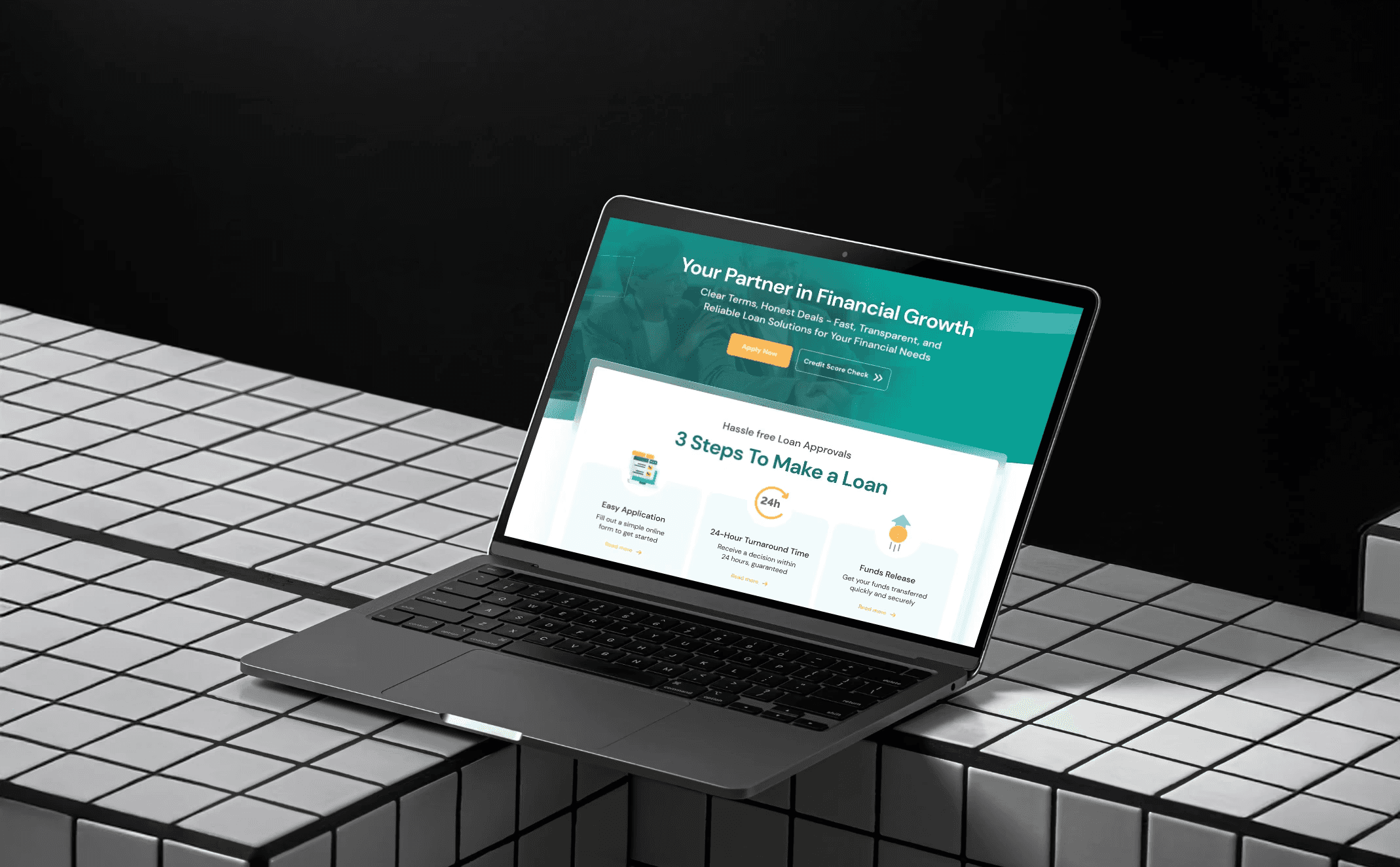
Zen Capital Prototype
Visual Design
A teal and orange color palette was chosen to evoke trust and optimism, paired with professional yet approachable typography to enhance readability and credibility. Trust elements such as client testimonials and success metrics were prominently displayed across the site.
4. Review and Iterate
Usability testing with participants representing key personas identified pain points like unclear service descriptions and subtle navigation links.
To address these, improving service descriptions with concise, engaging copy and added hover effects with bolder typography for easier navigation.
5. Deliver
After completing the design handoff, I worked closely with developers to ensure seamless integration of design elements and functionality, maintaining alignment with the project's goals.
Constraints and Challenges
Time was a significant constraint, with the entire project completed in two months. Collaborating with stakeholders to align on goals and priorities required clear communication and efficient decision-making. Additionally, the content overhaul involved simplifying financial jargon into user-friendly language, a critical step to improve accessibility and understanding for a broader audience.
Success Metrics
• +33% Increase in Client Inquiries: Clear CTAs and engaging content boosted conversions.
• -20% Reduction in Bounce Rate: Improved navigation retained visitors.
• Positive Feedback: Clients praised the professional and intuitive design.
What I learned
This project reinforced the importance of trust-building visuals and clear messaging in financial services design. I also learned how iterative testing and user feedback refine solutions to better meet user needs. Working under tight timelines required prioritization and adaptability, skills that contributed to the project’s success.
The Problem
Zen Capital’s existing website struggled with multiple challenges. Visitors often found it difficult to understand the company’s financial offerings due to unclear messaging. The outdated design failed to inspire confidence, and inefficient navigation resulted in high bounce rates and low engagement. These issues hindered Zen Capital’s ability to connect with potential clients and showcase its expertise effectively.
Design Process
1. Discovery
Stakeholder Interviews
Collaborated with Zen Capital’s leadership team to align on objectives, including improving client inquiries, modernizing branding, and simplifying user journeys.
Competitor Analysis
Benchmarked against industry leaders to identify gaps and opportunities for differentiation.
User Persona Development
Developed personas for key audience segments, including small business owners, potential investors, and individual clients, to guide design decisions.
2. Define
Research insights revealed key user pain points, which prioritized into actionable solutions:
• Users valued clear CTAs and simplified navigation.
• Trust-building visuals, such as client testimonials and metrics for increasing engagement.
• Interactive tools like loan calculators were highly desirable for financial planning.
3. Develop
Low-Fidelity Wireframes
Emphasized intuitive navigation and structured sections for services, testimonials, and CTAs.
High-Fidelity Prototypes
Introduced a modern layout, interactive tools, and consistent branding with a clean, minimalistic aesthetic.
Zen Capital Prototype
Visual Design
A teal and orange color palette was chosen to evoke trust and optimism, paired with professional yet approachable typography to enhance readability and credibility. Trust elements such as client testimonials and success metrics were prominently displayed across the site.
4. Review and Iterate
Usability testing with participants representing key personas identified pain points like unclear service descriptions and subtle navigation links.
To address these, improving service descriptions with concise, engaging copy and added hover effects with bolder typography for easier navigation.
5. Deliver
After completing the design handoff, I worked closely with developers to ensure seamless integration of design elements and functionality, maintaining alignment with the project's goals.
Constraints and Challenges
Time was a significant constraint, with the entire project completed in two months. Collaborating with stakeholders to align on goals and priorities required clear communication and efficient decision-making. Additionally, the content overhaul involved simplifying financial jargon into user-friendly language, a critical step to improve accessibility and understanding for a broader audience.
Success Metrics
• +33% Increase in Client Inquiries: Clear CTAs and engaging content boosted conversions.
• -20% Reduction in Bounce Rate: Improved navigation retained visitors.
• Positive Feedback: Clients praised the professional and intuitive design.
What I learned
This project reinforced the importance of trust-building visuals and clear messaging in financial services design. I also learned how iterative testing and user feedback refine solutions to better meet user needs. Working under tight timelines required prioritization and adaptability, skills that contributed to the project’s success.